Pareto
Pareto
Creating a leading brand for a new era
in facilities management.
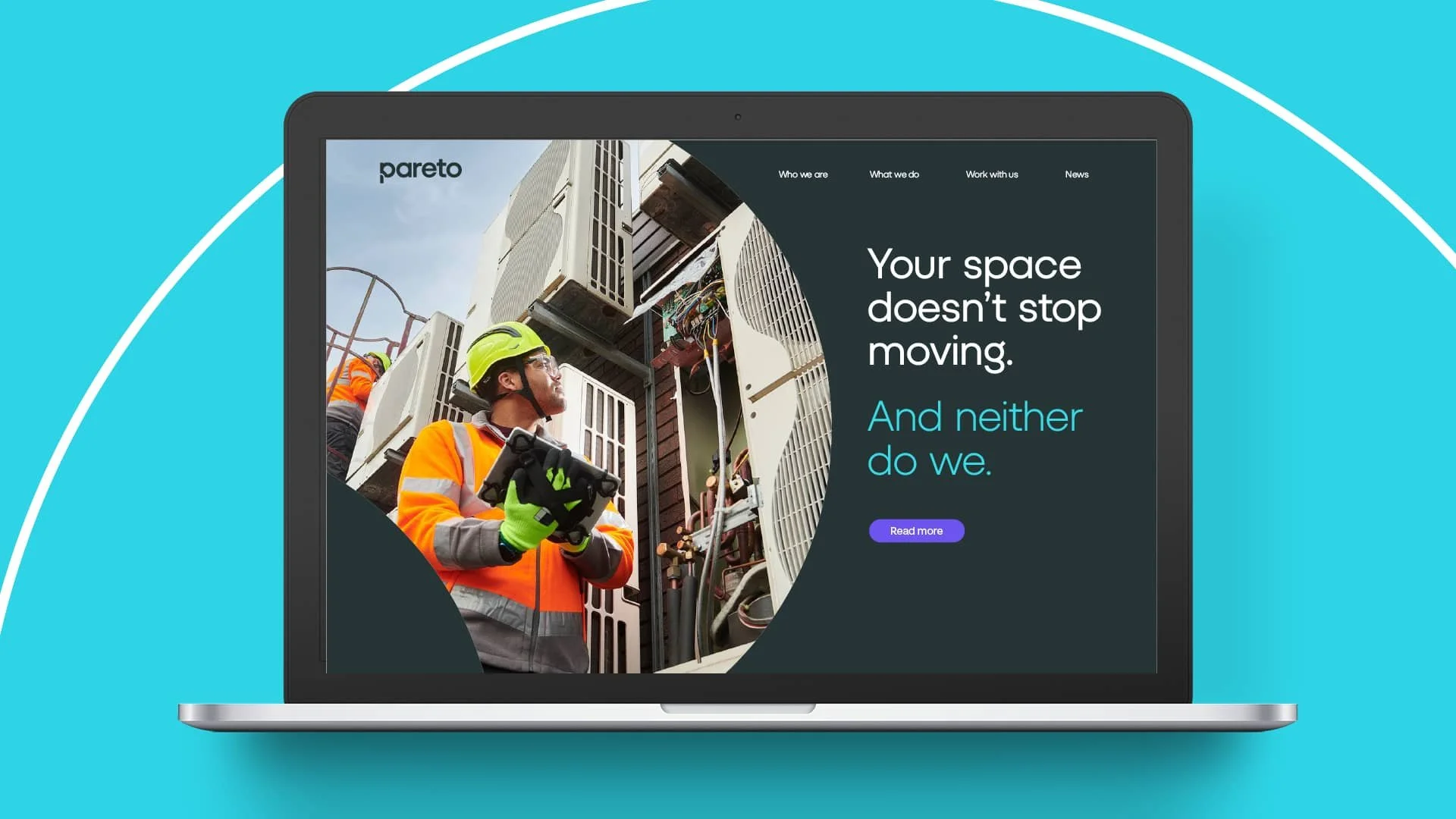
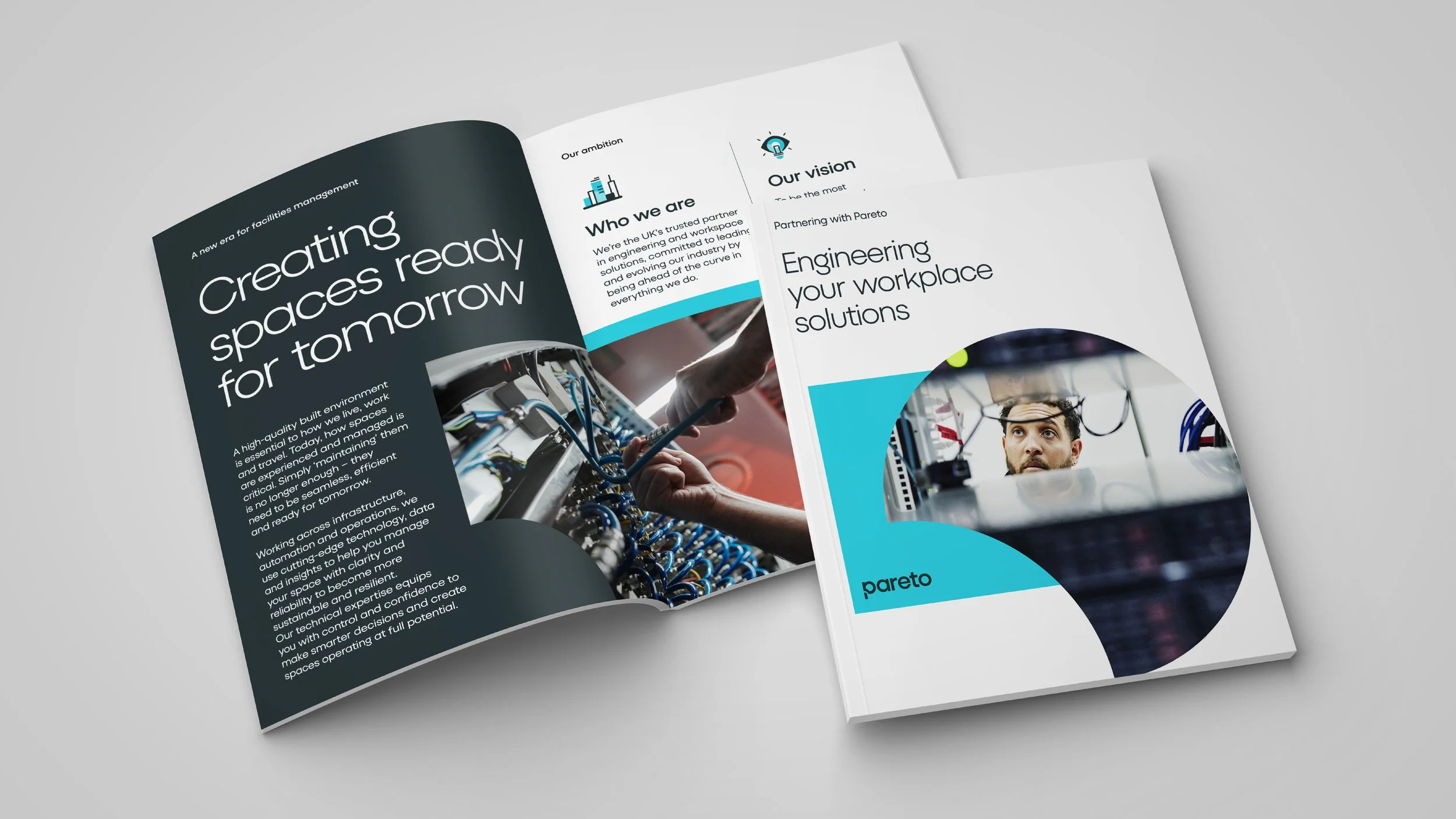
Founded in 2014 as a challenger brand with strong social value and DEI principles, Pareto needed to reposition itself in a rapidly evolving facilities management sector as a technology-led, long-term partner helping clients future-proof their spaces. We crafted every element of Pareto’s new identity, reflecting their new brand positioning “Ahead of the curve’.
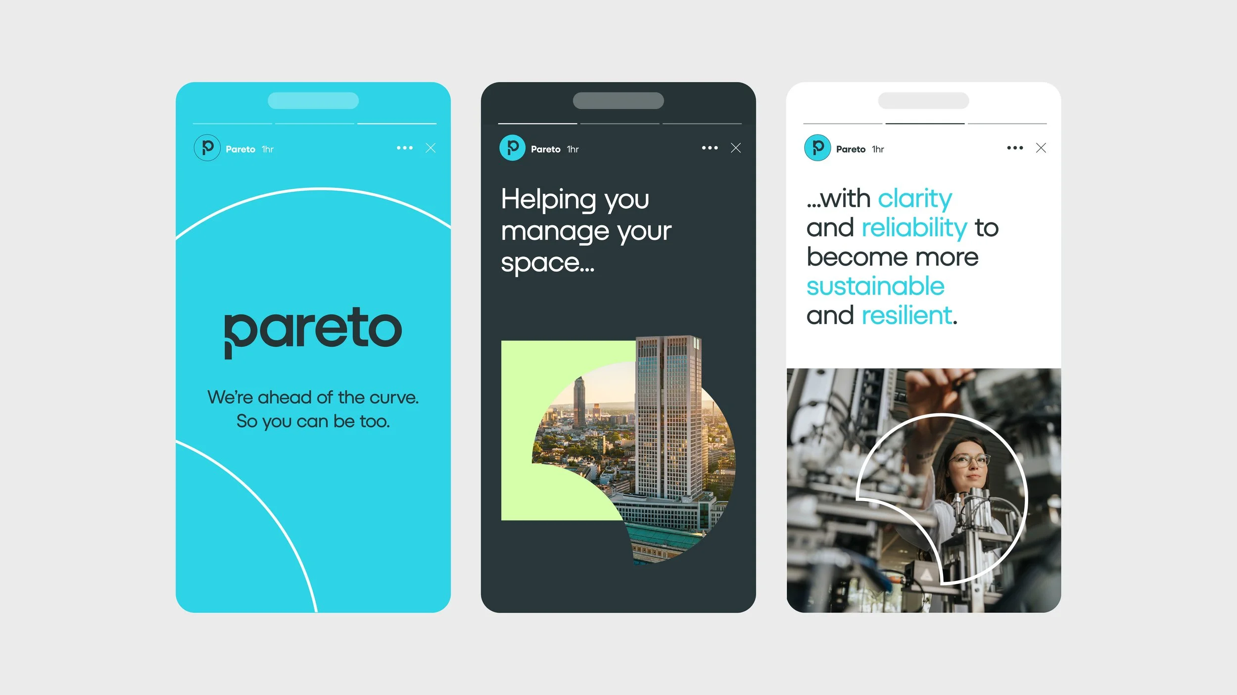
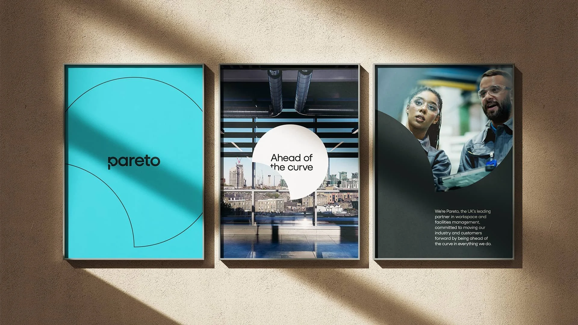
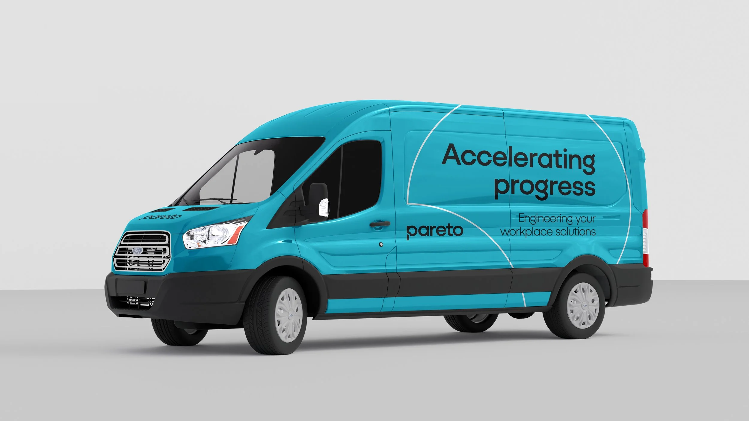
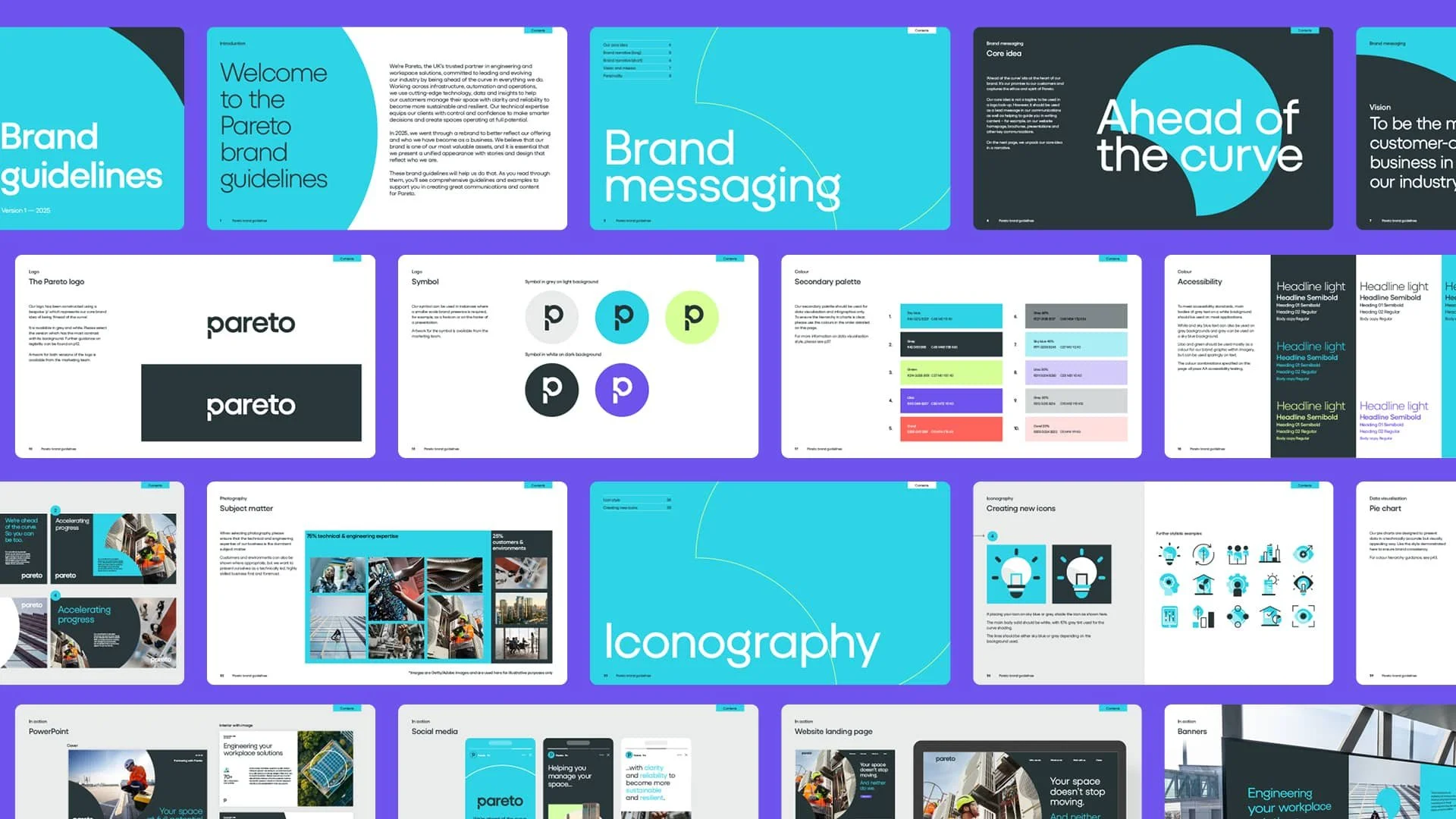
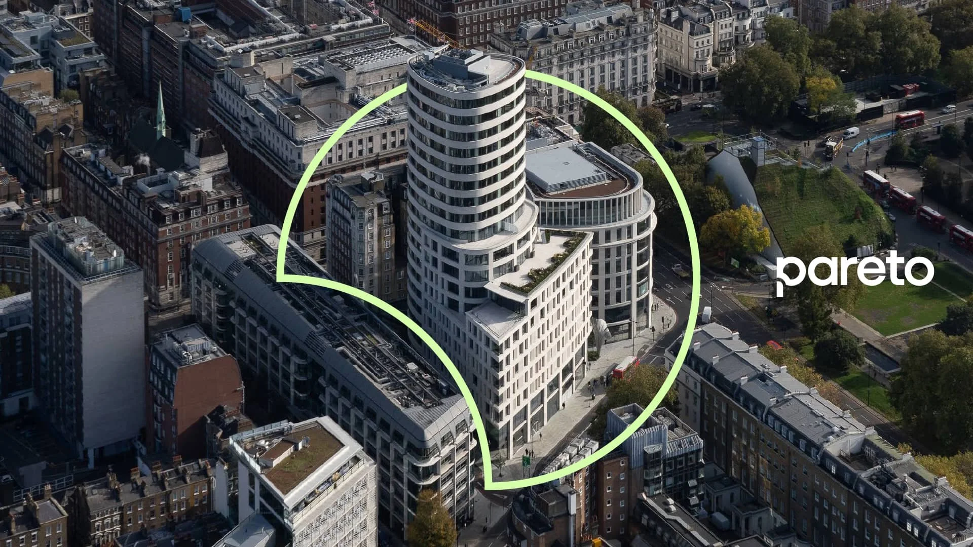
We brought this to life by creating a unique and instantly identifiable brand graphic, the ‘Pareto curve’. It appears on all communications and is used flexibly, along with photography, a new typographic style and iconography, creating a sleek brand graphics. A new style of art direction was developed to project a more authentic image of the company, framed around their dedication to detail. This unified visual language ensures that the company still stands out in its category as a challenger and that it appeals to a younger, more tech-savvy audience, while maintaining its credibility with existing customers.
I was involved across the entire process, from concepts to brand guideline creation.